Building a website? One of the first visual choices you’ll face is: dark mode or light mode? It’s more than just a style preference it can shape how users feel, interact, and stay on your site. In the growing debate around dark mode vs light mode website design, both have their loyal fans and unique benefits. From dark mode benefits for websites like reduced eye strain and a sleek modern look, to the clean readability of light mode website design, the right choice depends on your goals and audience. So, if you’re asking, “should my website use dark mode?”, this blog will help you decide with real-world use cases, tips, and expert insights.
What Is Dark Mode and Light Mode?
When designing a website, one of the most noticeable visual choices is the color theme — dark or light. But what exactly does that mean? Dark mode uses a dark background (usually black or deep gray) with lighter-colored text and elements. On the other hand, light mode (the more traditional style) features a white or light-colored background with darker text. Both styles have their place in modern web design and affect how users interact with your content.
In the ongoing conversation of dark mode vs light mode website design, it’s important to understand user context. Dark mode benefits for websites include reduced eye strain in low-light settings, a more modern aesthetic, and even better battery life on OLED screens. Meanwhile, light mode website design is easier to read in bright environments and is often considered more familiar and professional.
Still wondering, should my website use dark mode? The answer depends on your brand, content, and audience. Don’t forget to consider web design accessibility dark mode factors too—contrast ratios and readability must be optimized so every user, including those with visual challenges, can comfortably navigate your site.
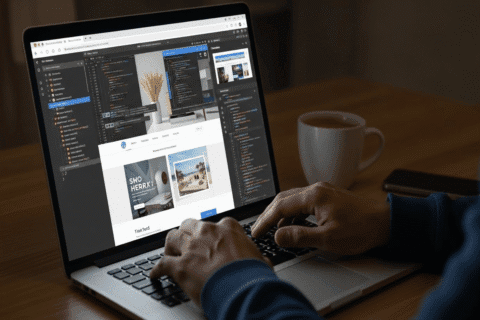
Do you need any website-related help? Let our experts guide you
Benefits of Dark Mode in Web Design:
✅ Reduces eye strain in low-light environments – One of the biggest dark mode benefits for websites is visual comfort, especially at night or in dim settings.
✅ Saves battery life – Particularly on OLED and AMOLED screens, dark mode consumes less power.
✅ Modern and sleek appearance – It gives your site a trendy, tech-forward feel and works well for portfolios, apps, and creative brands.
✅ Highlights visual content – Colors and images often pop more against a dark background.
✅ Supports accessibility – With proper contrast and readable fonts, web design accessibility dark mode becomes an inclusive option for users with visual sensitivity.
✅ Better for some content types – Dark mode is often preferred for dashboards, coding tools, and entertainment platforms.
✅ Custom user experience – Adding a dark mode toggle for websites gives visitors more control over their visual preference.
✅ Helpful for SEO? – While there’s no direct ranking boost, a better UX means lower bounce rates, which may raise the question: is dark mode better for SEO? It certainly contributes to improved engagement.
Benefits of Light Mode in Web Design:
✅ Easy to read in bright environments – Ideal for mobile users outdoors or in well-lit spaces.
✅ Familiar to most users – Many visitors are used to light mode website design, especially for blogs, news, and e-commerce.
✅ Clean and professional look – Great for corporate, finance, or healthcare websites.
✅ Higher readability for long-form content – Dark text on a white background is often easier on the eyes for reading-heavy pages.
✅ Simple to implement – Fewer design adjustments needed across different elements.
✅ Better contrast for some branding colors – Lighter backgrounds work well with a wide variety of logos and color palettes.
When comparing dark mode vs light mode website layouts, remember it also comes down to user preference dark or light mode — and the context in which your site will be used. For designers wondering how to make it work, smart UI design dark mode tips and proper testing are key to getting it right.
How to Pair Fonts for Achieving Visual Harmony on Your Website?
User Preferences and Accessibility Considerations
Not every user experiences a website the same way. Some love the sleek feel of dark mode, while others find it harder to read. That’s why it’s essential to consider user preferences when choosing between themes.
Many websites now let users switch between modes using a dark mode toggle for websites. This small feature can make a big difference in user satisfaction. By offering both options, you allow people to browse in a way that feels best to them, day or night, young or old.
When it comes to accessibility, contrast and readability matter most. Dark backgrounds must have enough contrast with text and buttons to avoid eye strain or confusion. If you’re designing a dark-themed UI, follow basic UI design dark mode tips like using subtle accent colors, readable fonts, and clear icons. This ensures everyone, including users with visual impairments, can navigate your site with ease.
And what about search rankings—is dark mode better for SEO? While dark mode doesn’t directly affect rankings, offering a more comfortable and accessible user experience can lower bounce rates and increase time on site—two factors that support SEO performance. In short, listen to your users, make your design flexible, and focus on accessibility first. That’s how great websites are made.
Also Read: Advanced Animation Techniques in Web Design
Which Mode Is Better for Your Website?
Choosing between dark mode vs light mode website design isn’t just about looks—it’s about purpose, audience, and usability. Here’s a breakdown to help you decide what works best for different types of websites:
🛒 E-commerce Websites
Best fit: Light Mode
Customers need clear visibility when browsing products, reading descriptions, and comparing prices. Light mode website design ensures clean readability and better trust signals, especially for first-time buyers.
🧑🎨 Portfolio or Creative Agency Websites
Best fit: Dark Mode
For photographers, designers, or agencies, dark mode makes visuals and creative work stand out. One of the key dark mode benefits for websites is how it enhances visual elements with minimal distraction.
📰 Blogs and News Platforms
Best fit: Light Mode
Text-heavy websites work best with light backgrounds for easier reading. However, offering both with a toggle is ideal.
📱 Apps or SaaS Dashboards
Best fit: Dark Mode
Users often spend long periods using these interfaces. Dark mode reduces eye strain and feels modern. Wondering, “should my website use dark mode?“—for platforms with frequent user interaction, the answer is likely yes.
🌐 Corporate or Professional Services
Best fit: Light Mode
Professional services such as finance, law, or consulting benefit from clean, traditional designs. Light mode projects reliability and clarity.
In the end, there’s no one-size-fits-all. The best approach is understanding your audience and possibly offering both modes with a user toggle. That way, you cover every base—style, comfort, and functionality.
Best Practices When Implementing Dark or Light Mode:
✅ Ensure Proper Contrast
Make sure text stands out clearly against the background—especially in dark mode. Poor contrast can hurt readability and accessibility.
✅ Avoid Pure Black or Pure White
Use softer shades like dark gray or off-white to reduce eye strain and create a more pleasant viewing experience.
✅ Choose Colors That Work in Both Modes
Accent colors should remain visible and consistent in both themes. Test how buttons, links, and icons appear across modes.
✅ Use a Dark Mode Toggle
Give users control with a simple dark mode toggle for websites. Letting them switch based on preference enhances UX.
✅ Test Across Devices
Make sure your design looks good on phones, tablets, and desktops in both modes. Responsive design still matters here.
✅ Follow UI Design Best Practices
When implementing dark mode, follow proven UI design dark mode tips like keeping fonts legible, avoiding overly saturated colors, and spacing elements well.
✅ Keep Branding Consistent
Whether dark or light, maintain brand identity—fonts, logos, and color schemes should adapt smoothly to both.
Final Verdict – Balance, Choice, and User Experience:
When it comes to dark mode vs light mode website design, there’s no one-size-fits-all answer. Each mode brings its own advantages dark mode benefits for websites include reduced eye strain and a modern feel, while light mode website design offers familiarity and clarity for content-heavy pages. So, should my website use dark mode? The best choice depends on your audience, content, and brand identity. Ideally, offering both options with a toggle gives users the power to decide ensuring a more inclusive and user-friendly experience overall.
❓FAQs:
What is the difference between dark mode and light mode in web design?
Dark mode uses a dark background with light text, while light mode features a light background with dark text—each creating a different visual experience.
Is dark mode better for user experience?
It can be, especially in low-light settings or for prolonged use, as it reduces eye strain and creates a modern, sleek look.
Should I offer both dark and light modes on my website?
Yes, offering both with a toggle gives users the freedom to choose what’s most comfortable for them.
How does dark mode affect website accessibility?
If not designed with proper contrast and readable fonts, dark mode can reduce accessibility for users with visual impairments.